Portmaster 1.1
Updated SPN map and lots of optimizations.
All new SPN map
In this release we re-imagined the SPN map. It now focuses on making more information easier to discover and understand. When you open the map now, you can see that some countries are darker than others - this allows you to easily see which countries already have SPN nodes.


It is also easy to see which nodes you are currently using and if they are operated by Safing or by the community. Safing nodes are displayed as triangles while community nodes show as circles, and are colored in blue and green respectively, if in use.

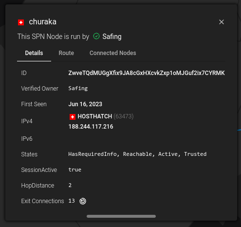
The information boxes for nodes now have a lot more information and you can get to all the details a lot faster.

There are many more views to find so go around and discover all the new things in the map!
Other Changes
Of course there have been many under the hood improvements like optimized traffic management for SPN or extended DNS caching. A complete list of changes can always be found here: GitHub
Next Steps
Thank you to all the people telling us their feature ideas - we know you are exited about many new Portmaster features. I am glad to let you all know that for the next update we are focusing again on firewall features. I can’t share much at this point but stay tuned, there are many requested features in the pipeline.
July 11, 2023 • Written by Raphael

